
Responsive or Mobile-First Website Design? You’ll have your answer here!

According to research by We Are Social, in early 2019, Vietnam had 64 million Internet users and 96% of them used mobile devices (smartphone, tablet, or laptop) to access the Internet. This indicator represents the modern behavior of today’s Internet users, using mobile devices to serve the needs of information inquiry, entertainment, study, and work. However, there was a time when Internet users had difficulty logging in to websites because the website size was too large compared to the small size of mobile screens.
Up to now, the concept of Mobile Standard Responsive Web Design is considered a dynamic concept, because it is still being developed and changed. This classification in RWD website design methods includes Mobile-First, Desktop-First, and Adaptive Web Design. In this article, we will focus on Mobile-First and Responsive or Desktop-First.
1. Responsive Web
Responsive Web Design standards are actually understood as website design standards for desktop computers, or the full name is Desktop-First design. The Responsive or Desktop-first design standards, require the website to have maximum resolution sizes and then be scaled down to the smallest resolution size.
Responsive Web Design is a relatively new approach to website design that ensures users have a viewing experience regardless of the type of device they are using. This has become increasingly important over the past few years as mobile ownership has exploded and traditional PC sales have slowed. While Google is prioritizing mobile-friendly websites in its search results algorithm, it’s important to make sure your site is optimized for mobile using design response.
Responsive web designs respond to changes in device display sizes. So when you display a website on a smartphone, for example, you’ll be looking at different dimensions than if you were viewing it on your tablet, laptop, or desktop, for example.
Think of responsive web design as water: it will fit into whatever you pour it. Because it is shifting content to fit other devices, rather than taking into consideration the experience on those devices, the mobile experience can be lacking.
2. Mobile First
First, the reader will surely encounter a bit of confusion about the names RWD website design methodology. Many people misunderstand that Mobile-First Web Design and Responsive Web Design are the same but in fact, they are completely different.
The Mobile-First design is very important to consider because we have eliminated unnecessary spaces on the mobile device. This means that users will have less experience or smaller screens will appear cramped and over-filled which will seriously affect our customer experience. However, if they start a responsive design from small devices to getting bigger, we will realize that fixing CSS to a bigger screen becomes easier as total space increases.
It benefits us in many different ways because a website that works well on a smaller device can guarantee less viewport breakage when it hits a big screen.
Key Features of Mobile-First Design:
- Expandable “Hamburger” Menus
When browsing a website on your phone, it’s annoying to have to open multiple tabs — or worse, lose the page you were on because you clicked away too soon. Yet on many responsive websites, users have to click several times just to navigate to one interior page. A mobile-first approach modifies the navigation process significantly.
- Larger Buttons
Cell phone users navigate with their thumbs, not an itty-bitty computer cursor. Therefore, mobile-first designs pay special attention to anything clickable— buttons are larger, hyperlinked sections are larger, and items in a clickable list or accordion are spaced further apart. No need to make it more difficult for folks with clumsy thumbs!
- Consolidated Content
Less is more, especially when it comes to the mobile experience. While responsive websites do condense all the content on a desktop to make it physically possible to read, the result is often not conducive to the average mobile visitor’s reading preference. Most people scroll past long paragraphs, and they’d rather not have to scroll through them at all. Mobile-first websites simplify bulky content and provide information in a way that today’s mobile users will engage with.
- Larger Font Sizes
Your text sizes also play a role in reading comprehension. To improve readability on your mobile-first website, font sizes should be no smaller than 16 pixels. (No one should have to zoom in on the screen just to read a few body paragraphs!).
For header text, go even larger. The key for mobile devices is to make information easy to scan so that users can find what they are looking for at a glance. Large headings help to separate content into smaller, scannable sections.
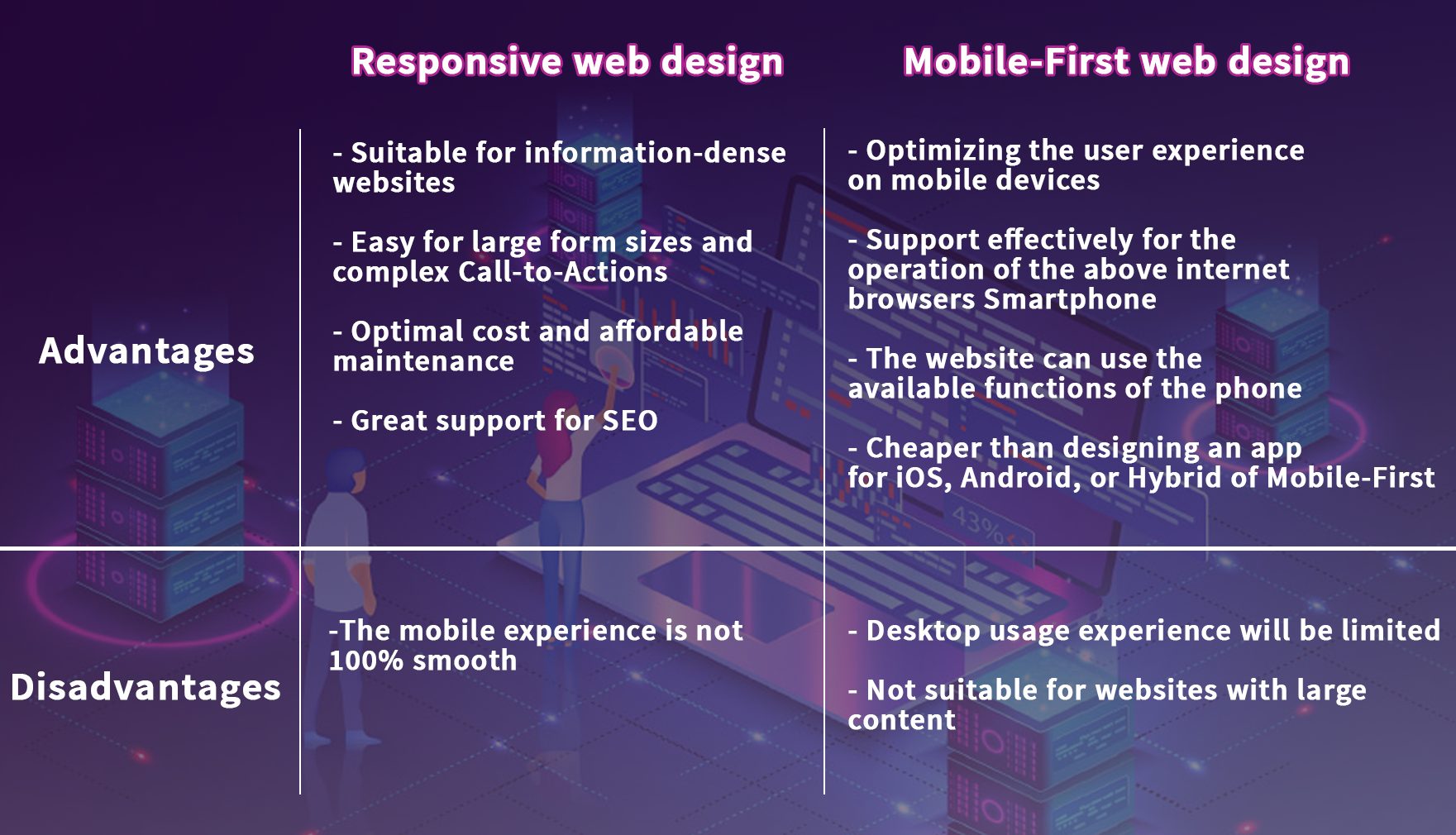
3. Pros and Cons of Responsive Design and Mobile-First Design
The Mobile-First design standard is similar to designing a mobile app and then adapting to the layout so the website can be neatly viewed on tablets and desktop devices. (desktop devices) without too much effort to calibrate.
To choose which design standards best suit your website’s activities, we come up with the advantages and disadvantages of each modern design standard: Responsive and Mobile-First.
3.1. Why use Responsive in website design?
The mobile standard responsive design is widely used for B2B businesses, where business websites need to provide a lot of detailed and official information. The HTML content is structured correctly so that the website is optimized for most search engines (SEO). Using Responsive technology in website design will simplify the need to design a separate mobile interface that comes with reduced programming costs, besides, Responsive is also recommended by Google, When Website Design at Uway will apply this Responsive standard to convert from a PC interface to a more mobile-friendly interface without having to program too much and lead to interface inconsistency between PC and SP.
For example, if your customers are key individuals in the company such as the CEO, Chairman, or a member of the Board of Directors then 80% of them will likely prefer using laptops or desktops to access the website during work time. Therefore, Standard Mobile Responsive Web Design will be the best choice.
3.2. Why use Mobile-first in website design?
Mobile-first design is a proactive approach to web design. It’s about creating a website that not only works on mobile devices but is designed for users on mobile devices.
If Responsive Web Design seems to be a pretty good choice, why should you consider Mobile-First design for your website? Very simply, the trend of users will gradually turn into users accessing the Internet using mobile devices entirely.
Each year, collecting data on the proportion of Internet users accessing the Internet with mobile devices is increasingly high. With the mindset to capture the movement of the times, what Mobile-First web design brings to your website is necessary.
Unlike Responsive Web Design, Mobile-First will completely focus on website design as an application on the phone, allowing a 100% perfect user experience on mobile devices.
The outstanding features of this design standard are less text, large fonts, fast loading speed, diverse content including video and audio, CTA per page, and more.
Also, the browser on mobile devices allows connection with smartphone functions such as camera, feedback, and voice recognition. Thanks to this, a Mobile-First design standard will bring a unique user experience to your website, helping you to lead the competition and attract more website visitors.
Here are the pros and cons of Responsive web design and Mobile-First web design:
- How to know if Mobile-First or Responsive is suitable?
As mentioned above, the main difference between responsive web design and mobile-first design is how the designer approaches the website. A responsive website is reactive — the design moves fluidly to fit devices. A mobile-first website is when the mobile website is planned and designed in tandem with the desktop site, making proactive changes to the overall design to ensure the mobile experience is just as good as the desktop experience.
While both designs make your website accessible on all devices, a mobile-first experience offers a better overall user experience because a variety of considerations are taken into account during the design phase, such as white space, font size, and load time.
You already know the benefits that each Mobile-First and Responsive design standards bring, as well as the context of the website’s operation, will also affect the decision to choose the right design form.
In this section, Uway will guide you on how to check the website’s activities, and evaluate the audience that your website is and need to target, from which you will have the correct answer for the design form so that it can optimize your website.
Answer the following questions:
- Who is the website audience you serve?
- How satisfied are website users with your website?
- What is the target user’s website usage behavior?
- What website content are you posting?
When you follow the activity tracking tag setup instructions for your website, Google Analytics will allow you to see the following metrics:
- What devices do your website users use to access your website, thereby helping you to know if your target audience is desktop or smartphone, or tablet users?
- How long they spend on your website will reflect their interest level or satisfaction level in their experience using the website.
- The content they love on your website, where high traffic will reflect the content characteristics that you need to develop for the website. Formal content and large size will require Responsive Web Design; otherwise, use Mobile-First.
Through this article, Uway hopes that we bring you some useful information about Responsive and Mobile-First Web Design so that you gain some knowledge and have your best decision on when to use these methods. Contact us if you want our team to help you design your splendid website!
Mar 07, 2021